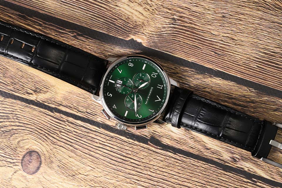
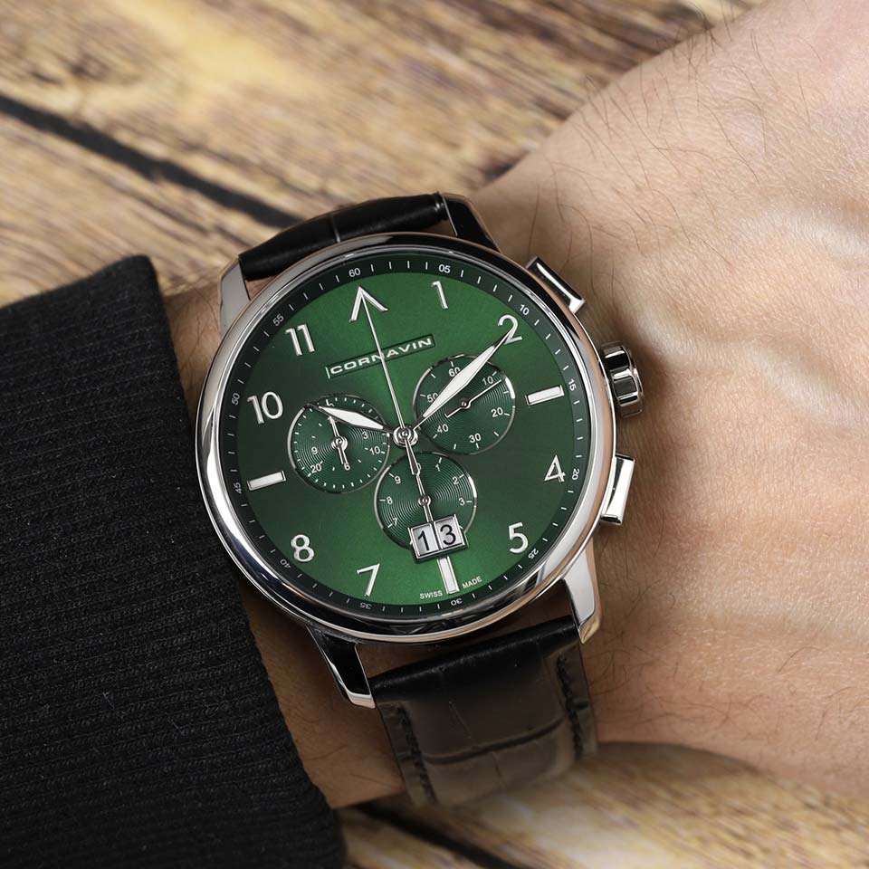
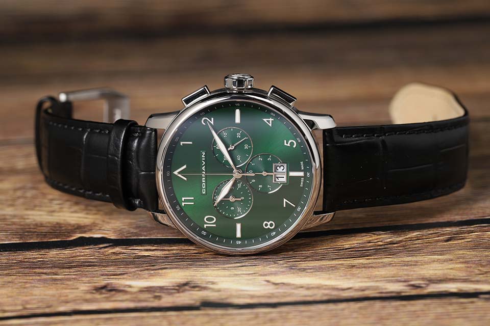
The green Cornavin chronograph makes a strong first impression and looks more expensive than it is worth. Objectively, the watch is very good: made without flaws, high quality and beautiful. But subjectively, they still do not squeeze up to the ideal.
Honest Swiss made: a subjective look at the essence of Cornavin
We got the impression that the DNA of modern Cornavin is “cheap but honest alternative to expensive watches” (the brand plays in the lower middle segment of the Swiss watch market). Cornavin does not invent its own designs, but uses the winning ideas of much more expensive legendary watches. The Bellevue line, as rightly noted in a recent review, is similar to Glashutte Original Sixties, which are thirty times more expensive.
The Downtown line refers to the Audemars Piguet Royal Oak. The Big Date line, which includes our CO.BD.05.L chronograph, according to the company, is inspired by Cornavin watches from the 1960s - but for some reason I see IWC chronographs in it. However, Cornavin does not stoop to outright copying.
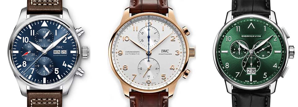
Compare: IWC Pilot Chronograph (see the shape of the hands and marks 3-6-9-12, dial finish), IWC Portugieser (XNUMXD numerals and small hands), our Cornavin.
Cornavin does not have marketing legends about "a history starting in 18th century Switzerland" around Cornavin, like some colleagues in the affordable segment. The watches are distinguished by a very good workmanship, but the budget is visible in the details - this is also honest. In general, if a watch is needed to show off sophistication in watches or emphasize wealth, this is not for Cornavin. And if you need a high-quality, but the most affordable Swiss machine for every day, then Cornavin is just for that.
However, there is also a highlight in the history of Cornavin. What other Swiss watches can boast of the Soviet past?
Monsieur Comrade Cornavin
The Cornavin watch is named after the central district and train station of Geneva. The brand appeared in 1922, disappeared from the radar during the years of the quartz revolution, and later returned to the market. More details can be found in the general overview of the history of the brand, and we will focus on two decades: the 70s and 80s. During these years, Cornavin had a connection with the USSR. What exactly was there is not clear: the official website is silent, there is no exact information on Russian and international watch forums.
Soviet watches were well exported to the West under "Western" names - for example, "Poljot" was sold as Poljot and Seconda. Probably, the USSR also needed the Cornavin brand as an export brand.
The Swiss company to cooperate, probably, was pushed by the "quartz crisis". In the 70s and 80s, mechanical manufacturers jumped at every opportunity to survive - they switched to quartz, invented new types of mechanism, moved factories to Asia, etc. Cornavin has also tried a lot. In 1976, he opened a division in Hong Kong, which lasted seven years. In the 1970s, he outsourced production: movements - Soviet, dials - Taiwanese, cases and assembly - Hong Kong. Apparently, this did not help, because in the 1980s, watches under the Cornavin brand began to be completely made at the Soviet factories Raketa, Polet, Luch, Zarya, Slava and ZiM.
Pay attention to the Cornavin logos in the photo below. From the original Swiss logo, the "Soviet" watches took a slightly modified "slide" typeface. On some, but not all watches, they added a “Soviet exclusive” - a new logo in the form of a swordfish. Maybe there is logic in it (there is an opinion that the swordfish was depicted on watches intended for export to "sea" Cuba). Or maybe not - for many years at least six independent factories worked under the Cornavin brand, and it is unlikely that they had a common brand book.
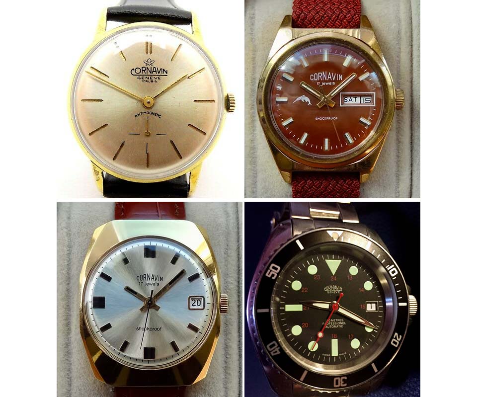
From left to right and top to bottom: Swiss-made Cornavin from the 1960s, "Soviet" Cornavin with a swordfish from the 1970s, "Soviet" Cornavin without a logo from the 1980s, Swiss Cornavin from the 1990s. Now the Cornavin logo is a simple typeface.
"Soviet Cornavin" was exported all over the world - from the countries of the socialist camp to Cuba and Latin America (models with days of the week in Spanish are known). They were also sold inside the USSR. Their story ended with the collapse of the USSR and the Soviet watch industry - in the 1990s, only old Soviet stocks remained on sale. Well, foreign collectors say that in the same 1990s they already bought new Swiss-made Cornavins.
Modern Cornavin is Swiss Made. This means that they are developed in Switzerland, they have a Swiss movement and 60% of the total cost of production is accounted for by Switzerland. Given that Cornavin uses foreign calibers (all quartz watches use Ronda), cases and other peripherals are probably purchased in Asia, and many models are produced in limited editions of 999 pieces, it seems to be correct to consider the brand a Swiss micro brand.
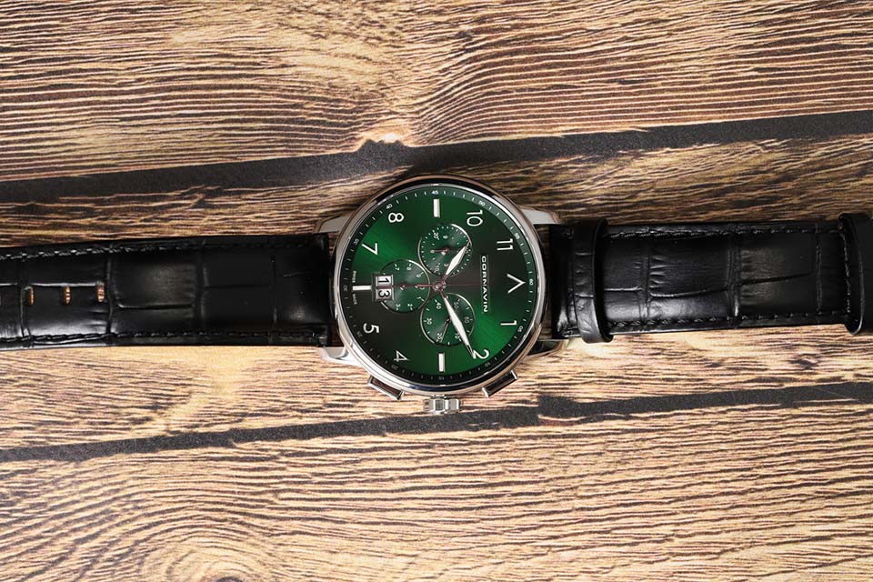
Now let's finally talk about watches.
Dial: the play of sunlight and attention to detail
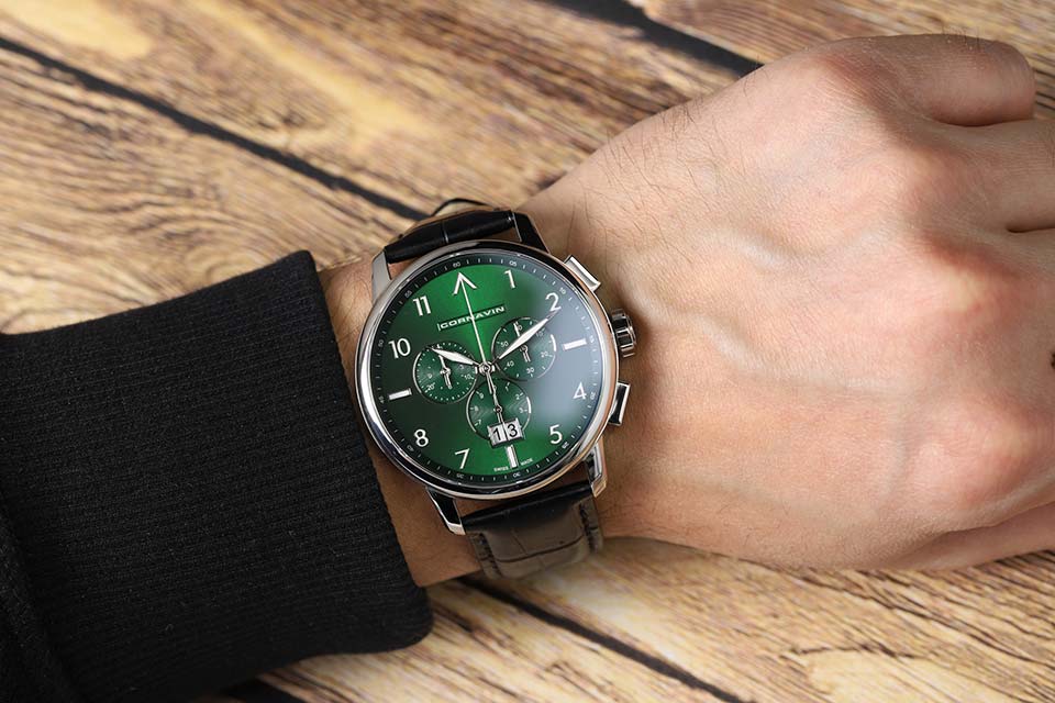
At the first acquaintance, the watch makes a very strong impression - primarily due to the beautiful dial. Fine radial polishing gives the effect of sun rays playing on a juicy green background. Three small dials are decorated with concentric guilloche, which also gives the effect of sun rays. The rays on the main dial and subdials are always directed in different directions, and if you turn the watch in the light, the rays are merrily chasing each other.
And most importantly, these are bevels along the edge of the sub-dials, polished and shining with a metallic sheen. A rare, beautiful solution - in fact, it is precisely this that delights! These chamfers rhyme with the polished frame that surrounds the double date - in a word, the design elements synergize with each other.
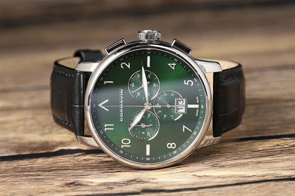
All tags are three-dimensional, overhead, metal, filled with a good white Super-LumiNova phosphor. Everything is done very carefully: no streaks and burrs, the position of the marks does not deviate from the markup. The pattern of the 3-6-9-12 marks, as you have already seen, hints at the pilot's chronographs. The phosphor hints at them: the numbers and marks glow completely - this is the norm for pilot's watches, but a rarity for "office" ones.
There is nothing special about the hands of the subdials and the central second - just neatly cut and polished hands. But the hour and minute are really good: rhombic shape (a reference to the famous pilot's B-Uhr), polished in a mirror and generously flooded with lume.
Originally solved the issue with the logo. It is not a consignment note, but it is printed on a voluminous "pedestal" - both beautiful and unusual. Of course, all the text on the dial - logo, inscriptions, markings on the slanted welt and small sub-dials - is immaculately printed.
Frame. Simple and tasteful
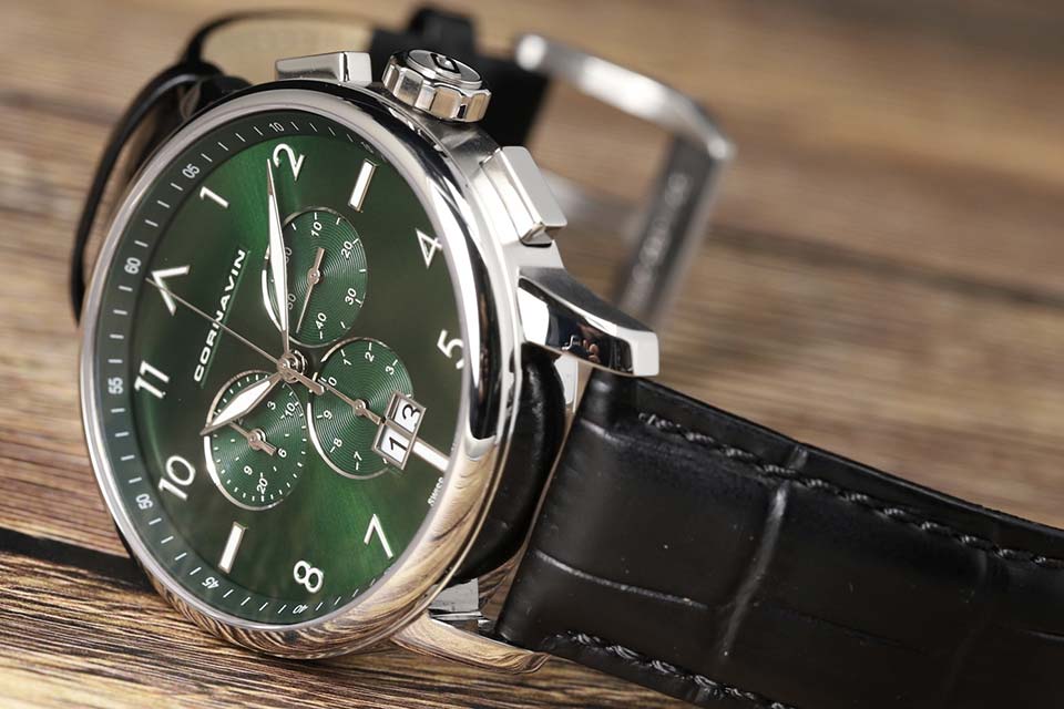
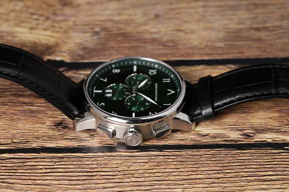
The case is rather big - 43 mm in diameter - and rather plump. The ears are short, almost not bent down, so the watch does not sit perfectly on the hand. But that's the only thing to complain about. The decor of the case is simple and elegant. Sidewalls - with fine horizontal grinding, which between the ears turns into polishing. At the top there is a slightly rounded thin polished bezel, and the lugs are chamfered. All this looks beautiful in the shade and plays with contrasts in the light - either the sidewalls look light and the bezel dark, or the polish shines over the matte sidewall. The geometry is quite decent - of course, one should not expect crazy Grand Seiko faces. And on top - a flat sapphire crystal, and without anti-glare: time is always visible, but it is difficult to capture a frame without a glare with a camera.
The bold, techno-inspired crown catches the eye, something you wouldn't expect to see on such an elegant watch. Large, grippy, it is most similar to an 8-sided nut and seems to say hello to the Cornavin Downtown line (and personally to Gerald Genta). Upon closer inspection, the nut also turns out to be elegant: on the relief end, a polished octagon frames a polished volumetric "C" rising above a matte background. The crown does not screw down, but the watch has a life-resistant water resistance of WR8. The chronograph pushers are also polished - the top one starts and stops the countdown, and the bottom one resets it.
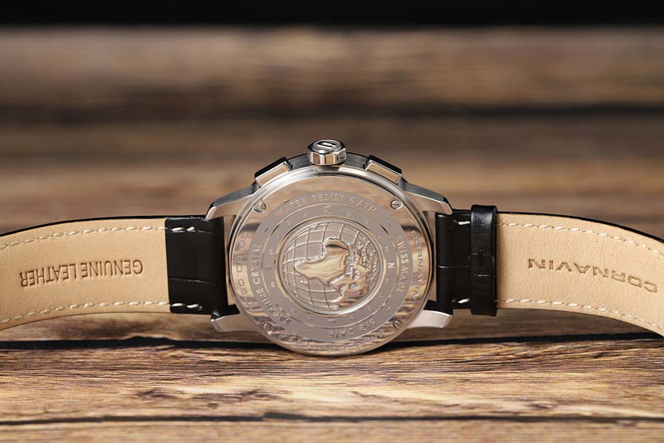
The back covers of the Cornavin Bellevue and Downtown lines are rather boring - the brand name, service information and a shallow pattern. But the cover of Big Data is decorated with a chic, deep, three-dimensional engraving depicting a globe. There is a mystery in it: although the brand seems to have nothing to do with Africa, for some reason this continent is in the center of the image. From Eurasia, where the clock comes from, only a piece that goes beyond the horizon has climbed.
The lid is not a cracker, as one would expect with a WR50, but on screws. It would seem nothing special. But in the context of octagons, quotes from legendary watches and beautiful engraving, they are perceived not as an element of fasteners, but as part of the design and a reference to the same AP Royal Oak.
Caliber - Honest Ronda
The watch has an honest quartz Ronda 5050.B. This is a caliber with 6 or 13 jewels (depending on the version), which is very good for a quartz watch. And in general, in terms of reliability, Ronda has a good reputation.
Chronograph capacity - 12 hours, accuracy - 1/10 of a second. The sub-dial “at 9:30” is not quite ordinary - it combines a 12-hour drive with a minute one: the hour and minute hands, as in a regular watch (in the zero position, they hide one under the other). The seconds are counted by a large central hand, which only runs in chronograph mode. “On 6” is the accumulator of tenths of a second, “on 2:30” is a small second that always goes.
When the chronograph is reset, the hands smoothly wind forward to zero. The hour and minute hands of the chronograph share a common electric motor, so if you reset the chronograph after 10 minutes, the hour hand of the chronograph will slowly scroll forward until it reaches the 12 mark, and the minute hand will make 12 full revolutions. Well, yes, this is normal - just the design of the caliber.
But what is really sad with Ronda is that the second hand does not hit the marks in many copies. This applies to our Cornavin as well as much more expensive watches like Tag Heuer. It would be nice if it concerned only the central second - it rarely annoys, only in chronograph mode. But even for a small second, misses in 5-second risks are visually noticeable. However, if you need Swiss quartz, where a second is guaranteed not to miss - take the Longines Conquest VHP with control of the position of the hands, I don’t remember other options.
Manipulations with the chronograph are tactilely good. The buttons, of course, are not pressed with such a clear click as the mechanics - but not with such shapeless viscosity as the starting Casio. The declared accuracy for 5050.B is from -10 to +20 seconds per month, there is a hack (stopping the second hand for fine tuning).
Big double date - with a fast translation in the second position of the crown. What is very good, there is a function to correct the chronograph hands if they go astray. True, the step during the adjustment is fixed - one division. This means that a large shift of the arrows can be corrected, but an inaccurate hit on the mark cannot.
Good! But…
Cornavin is good. The design is hard to fault. But there is a "but".
First and foremost is the overall impression. The design is correct, cute and… not memorable. Remove the logo from Panerai, Tag Heuer Formula 1 or Seiko and Citizen and you will still have a rough idea of what is in front of you. Remove the logo from CO.BD.05.L and you'll have to guess for a long time what kind of watch it is: “Micro brand? Something with AliExpress? IWC? Aaah, Cornavin, and how I didn’t guess right away. ”
Universal discreet design can be sold to a wider range of customers, bright watches are less compatible with different styles of clothing and get bored faster ... But all this insipidity pretty quickly killed the initial wow effect.
The second is the second hands, beating past the marks.
The third is a white date dip on the green dial. Yes, these are trifles, but they hurt the eye. Therefore, the watch, in our opinion, is made well - but not great.
