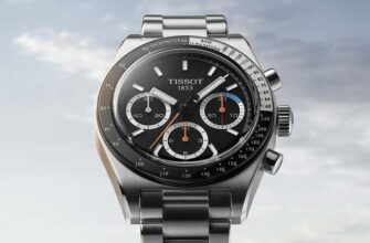
For taste and color, we have been repeating for many years, there are no comrades. This popular version of the popular expression de gustibus non est disputandum, in the original of which "color" is not mentioned, over the years, however, has expanded its sphere of influence on the world of colors and our perception of them. But the world of watch mechanics lovers is good because it unites a wide variety of people, our community in most cases finds a common language and does not fight.
This is how we usually agree on the popularity of this or that color of the dial, the shades of the design of the case and set the tone, form entire directions. Do you think it's loud? Not at all. Recent limited series of watches of various brands, released at the insistence of members of watch clubs (forums, etc.) and ordinary buyers at the same time, clearly show that vox populi is stronger than ever. Look, as soon as some shade of the dial declares its popularity (read - commercial success), brands from A to Z instantly use it.
We will not analyze today the phenomenon of a blue dial framed by a steel case, the topic is too extensive, instead we will go ... fishing! Knowledgeable people immediately realized that we were going to salmon. The most famous representatives of the family are salmon, pink salmon, chum salmon, nelma, sockeye salmon, coho salmon, chinook salmon, trout, whitefish, omul, char, grayling, taimen and lenok, sorry if I forgot anyone.
Recently, the demand for watches with a pink ("salmon") dial seems to have reached a new level: vintage watches are becoming increasingly difficult to find, and modern watches from both large brands and small independent manufacturers flaunt this shade all the time - but still more in catalogs than on shelves.
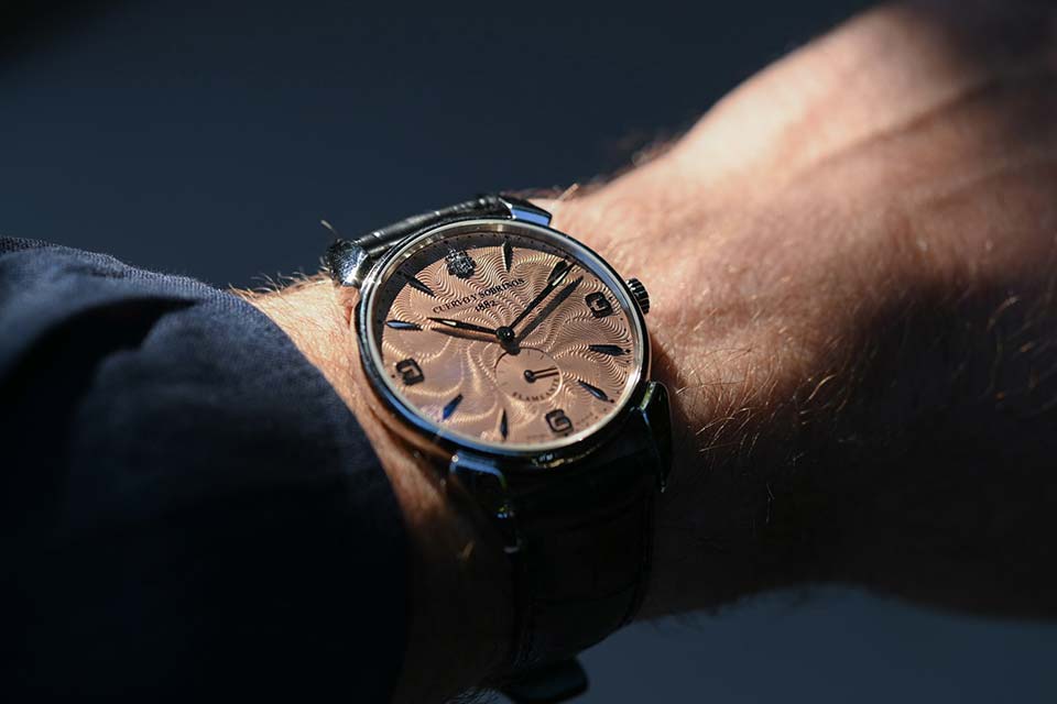
The incredible popularity of the fish-colored dial, in my opinion, can be explained quite simply, even if it is backed up by decades of watchmaking history.
Firstly, models with this design option are quite rare. And this is despite the fact that in the middle of the last century, pink was already experiencing a kind of “boom”. By the 1950s, the design of the case, the forms of watches of different brands came to a common denominator, there was no great variety that we are seeing now, and in order to compare favorably with competitors, brands tried to embellish their dials. Salmon pink was used much earlier, during the Art Deco period, but as we approach the middle of the 20th century, we begin to notice the growing importance of “innovation” in dials.
Salmon hue can be found on watches from that period by Vacheron Constantin, Patek Philippe, Rolex, Longines and Omega, to name a very short list. Remember also that brands in those years did not produce dials themselves, but placed orders with specialized companies (Stern Frères, for example), and these contributed to the spread of the “fishy” shade among manufacturers, offering the same dials to all their customers at once, reducing production costs. But the fate of mass production watches is clear to us - not being a very valuable item that is worth passing on from generation to generation, such now coveted specimens were broken, lost, forgotten, replaced by quartz models - in a word, they disappeared like dinosaurs.
But the trends for the modern world of collectors and amateurs are set, of course, by iconic watches, and here Patek Philippe enters the scene. While some offered an "unusual" color as the standard, Patek Philippe produced "pink" mainly at the request of customers, and this was until relatively recently. And this only added fuel to the fire of the desire to have a watch of color, like the famous 3970G perpetual calendar chronograph model, created by order of Eric Clapton (I hope you know who it is), and fixed in the minds of the public the connection of the great brand with "fishy" dials, making pink super coveted, even though other watchmaking giants have not lagged behind in popularizing this shade (Vacheron Constantin, Audemars Piguet, for example).
Secondly, but not least, the pink dial, under certain conditions, is extraordinarily beautiful. “Salmon”, by the way, this shade began to be called recently, there was no mention of fish in the catalogs of past years, it is now with the light hand of watch enthusiasts that hand out labels to models, salmon has become established as an official designation. From dark copper tone to light pink, the color has undergone endless variations over time, and they are all charming in their own way.
We have already spent enough words explaining the iconic status that pink now enjoys, but if this color did not make a unique impression when worn on the wrist, this success would not have happened. Framed in a – usually white – metal case, the pink dial communicates through the optic nerve to our gray cells something that, for others, is comparable in emotional power to the first look at the unique James Webb images of deep space that NASA recently released. Something enchantingly delightful and especially magnificent.
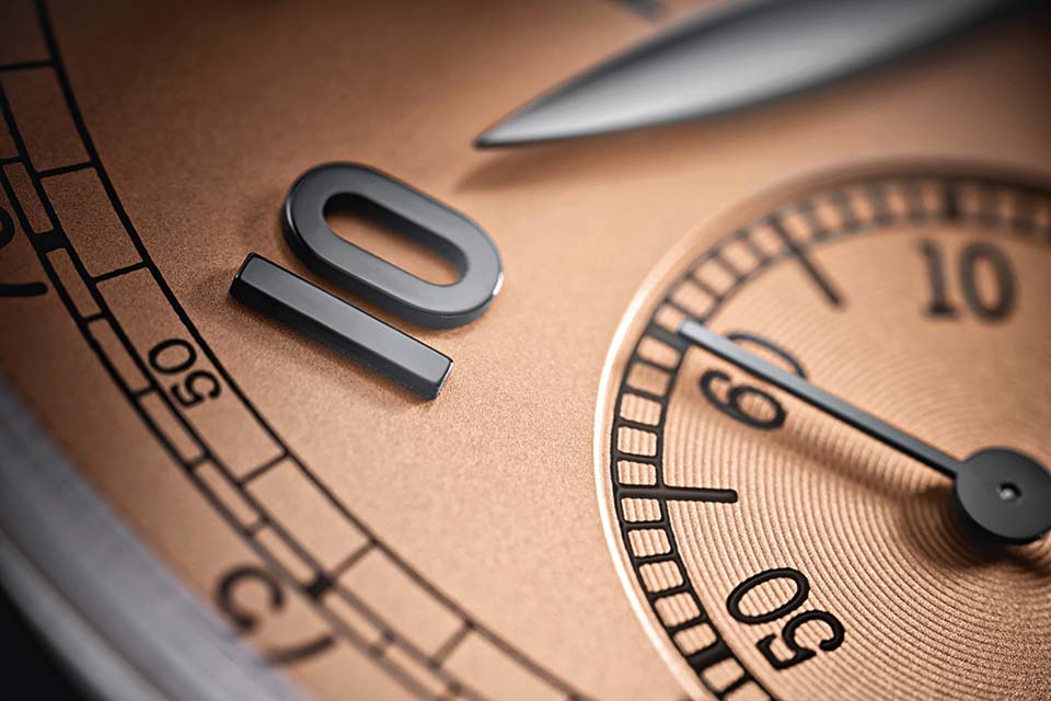
As a dry summary: the pink color of the dial of individual watch models, due to their rarity and beauty, attracted the attention of collectors and watchmaking enthusiasts, and this obsession with color, as one of the components of the search, turned into a widespread hobby, a separate phenomenon that ordinary people were also carried away by. buyers. By a happy coincidence, most brands hold back the onslaught and do not oversaturate demand, so we predict long-term popularity for salmon. But have time to catch yours - contact the dealer, suddenly it will help.
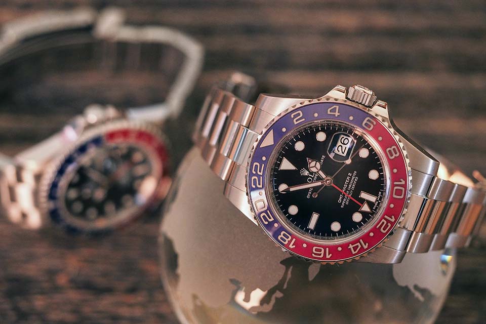
From pink fish to sweet soda. Guessed again, let's talk about red and blue (as in the Pepsi logo) on watch bands and dials. This combination is found among budget and not so watch manufacturers, where with the world time / GMT function, where in watches for divers, but the Rolex GMT-Master watch is unconditionally recognized as the ancestor of this combination.
The story that we are always happy to tell is that in the 1950s, during the heyday of air travel, Rolex and PanAm joined forces to create a model that could tell the time in two time zones at the same time, because such a function was a life-saving professional. necessary for airline pilots. (That being said, most pilots I've ever met found it strange to ask how they determine time in flight - "instrumentally, of course" - but PanAm may have had other settings.)
Be that as it may, in 1955 the first GMT-Master was born with a two-tone red and blue bezel, this separation was supposed to help in determining day (red) or night (blue) when reading from the dial. On watch forums, disputes about why suddenly red and blue are still not abated, they are trying to link them with PanAm corporate colors and cockpit lighting features, someone contacted Rolex directly for clarification, but as usual in this office - no comment. In such cases, it seems to me that everything is rather prosaic - as when painting some of our administrative buildings. There is a pink one in stock - let's paint the district council in pink. Left green? Suitable for kindergarten? Then we paint. The Rolex left the blue and red, so they put it into action ...
These are, of course, jokes, let's take a serious look at the matter, assuming that the pilots in the 50s and now compare the time with the watch on their wrist.
Aircraft cockpits are indeed lit differently than the cabin of an aircraft, and this is done so that the pilot's eyes get used to a uniform light, for an easy transition to the "night vision" mode. This uniform light is red, and under red lighting, blue looks black, that is, on the rim of the watch, the already contrasting combination should, in theory, be enhanced. Question: why not immediately make the blue part black? Variant of answer: blue, like red, which was not used in the PanAm logo, but was still present in advertising and in the interior design of the aircraft, could be called the colors of the company's corporate identity, which is why the choice was made in favor of blue with red.
It can be assumed that the decision was single-handedly taken by one of the company executives or designers, or the pilots were given a choice of several proposed options and they settled on one that would be recognizable from afar ... If so, they coped with the task - Rolex GMT-Master and its heirs are still easily recognizable from a considerable distance to this day, and you will find the red-blue Pepsi in watches where there is a functional explanation for this choice, as well as in those where it is an element of aesthetics and “character”.
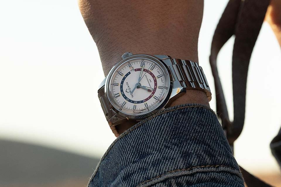
I won't list brands and articles by name, but it should be noted that the Norqain Freedom GMT is very interesting in all respects, those with a white dial and a red-blue scale of the 24-hour counter. As one famous advertisement said, "I would buy it."
As in the case of Salmon and Pepsi, the almost cult status of these classic watch designs has evolved over the years and will remain in this state for many years to come. At the behest of history, the classic, as a guarantee against accidents, causes less controversy, and unites in reverence around itself comrades who will be ready to argue about tastes and colors to the point of hoarseness, offer them a discussion on the topic, say, utterly modern Cvstos or Richard Mille. Perhaps next time we will do just that - we will discuss watches about which there is something to argue about.

