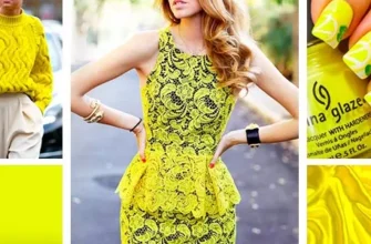
Modern girls and women are simply "stuck" in things of neutral shades and black-white-gray looks. Someone considers this a universal way of forming a wardrobe, someone simply does not want to suffer with color and print, thinking that it is too difficult to understand a person who is far from the fashion world. Meanwhile, psychologists argue that colored objects at a subconscious level are perceived by us as something positive and are remembered much faster and in more detail. Why not start enjoying it? Girls, want to cut into the memory of men - wear color!
Modern fashion does not dictate strict rules, does not impose patterns. And even the seasonal palette of the Pantone Institute is just a recommendation, not a guide to action. And if we discard all far-fetched stereotypes, then “making friends” with color and print is not so difficult.
How to beautifully combine color shades in clothes
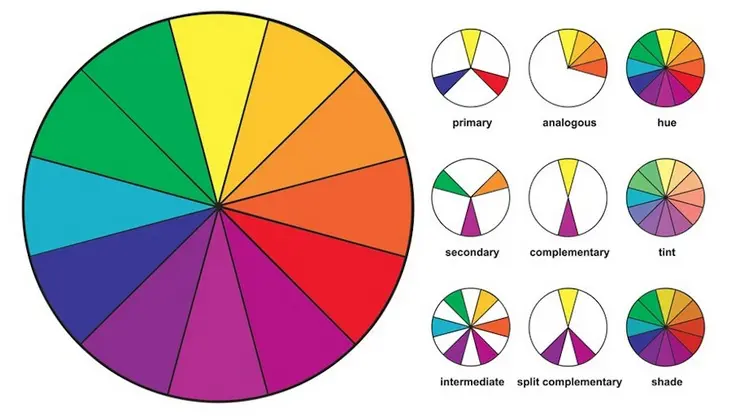
If you at least once turned to Google with a request for a combination of colors in clothes, then you will certainly come across the theory of drawing up color schemes according to the Itten color wheel. I must tell you that this is a great tool, these schemes work and they are easy to use. Start with them. You just need to pay attention to a few things that simplify the work:
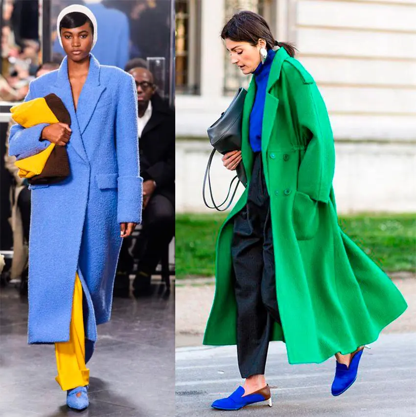
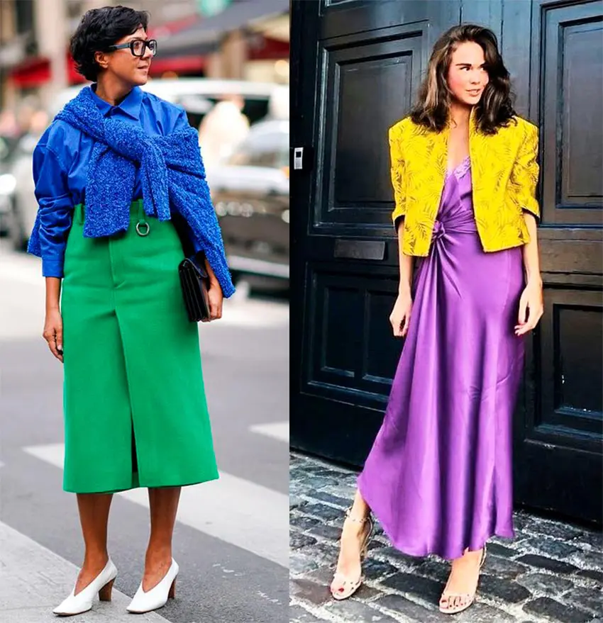
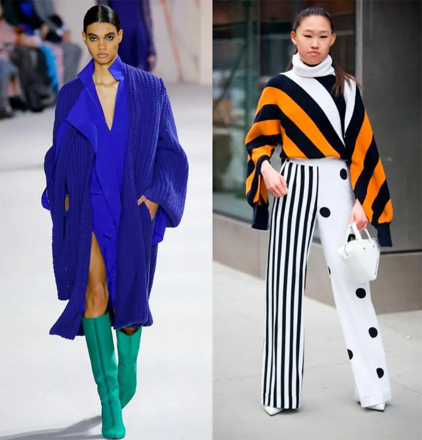
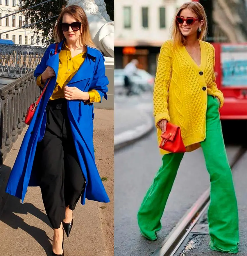
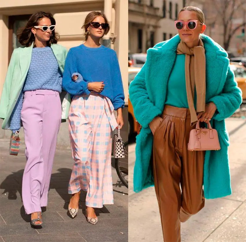
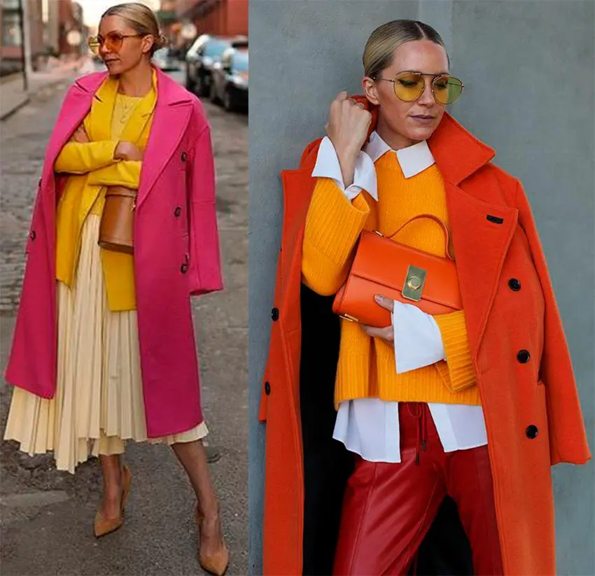
- The further along the color wheel the colors are located from each other, the more contrasting combinations they create. If you want to be extremely bright, choose opposite colors (for example, green and red). The closer to each other colors we choose, the less “flashy” our images will turn out to be.
- The use of lighter and more subdued shades will help to "reduce the degree" of contrast of even opposite colors.
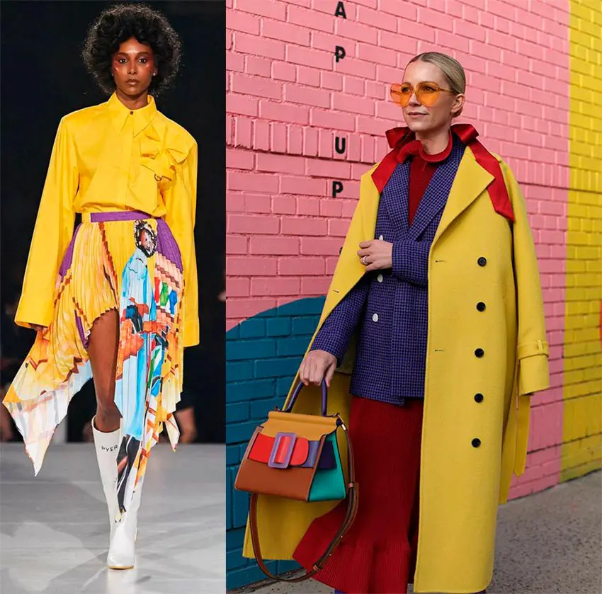
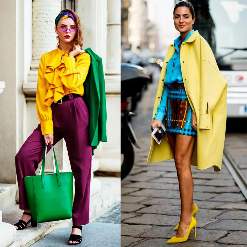
- When choosing schemes with three or more colors, it is better to use one color as the basis of the image, and add the rest as additional details and accents.
- To create sets that are more harmonious in terms of color, I recommend combining warm shades of colors with warm ones, and cold ones with cold ones. If you decide to combine a warm and cold shade, then let them be of the same saturation (we combine bright with bright, muted - with muted)
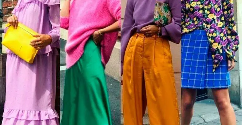
Another very simple scheme of "taming" color (and print too) is an option to combine clothes of bright colors with achromatic and neutral colors. This is just a godsend for those who are just starting to introduce colored things into their everyday life. Here an important role is played by the proportional ratio of bright and neutral (achromatic) - the larger the area occupied by a bright spot, the more dynamic our image will be.
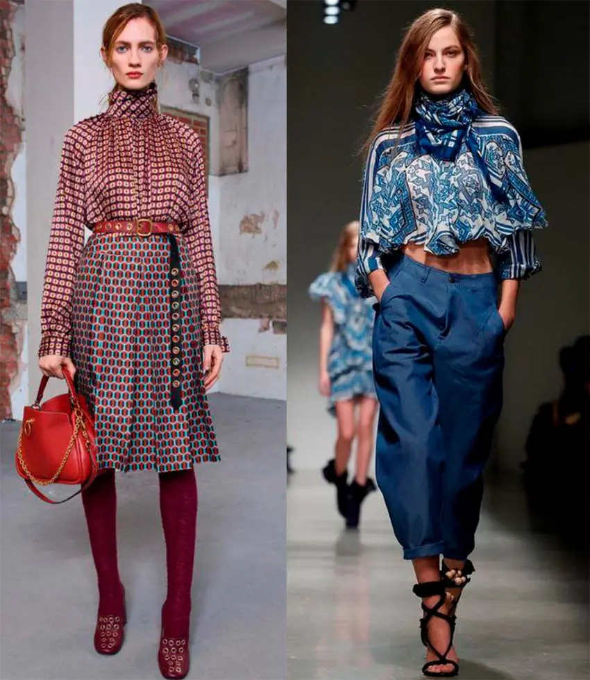
How to match prints on clothes
It is also not difficult to harmoniously combine printed clothes, if you adhere to some recommendations:
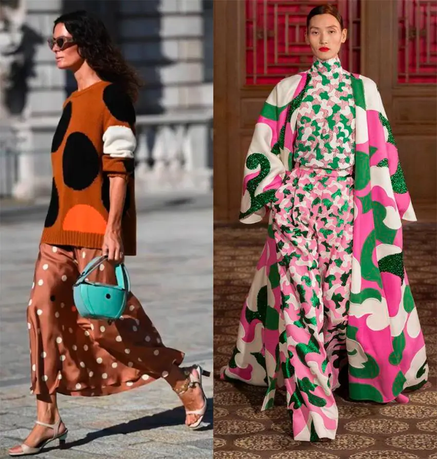
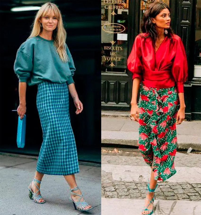
- We can easily combine neutral prints (small, discreet, practically merging into a single pattern) with each other, with any plain clothes, with any colored things and with accent (large) prints. At the same time, we try to find a connection between things either by "color" or by the "character" of the picture.
- Two accent (large) prints are easier to combine if they are of different sizes (for example, a large check and a smaller stripe).
- Almost any prints that contain identical colors in their drawing are perfectly combined.
- When combining prints in different colors, you can also use Itten's color wheel color schemes.
- When combining prints, it is important to pay attention to the style of the image - prints that have a pronounced style affiliation will look inharmonious with each other if the styles to which they belong do not combine well with each other.
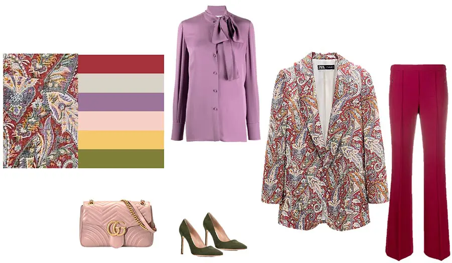
And now let's look at a practical example of building an image with a printed thing. One of the basic schemes for creating a set with a printed item (from which you can eventually get a color "backbone" to create an entire wardrobe capsule) will be the scheme of the so-called "isolating the color palette from the print."
For example, we fell in love with a checkered jacket. Everything about it is perfect: the fit, the color, and the fabric. How to choose things that match in color to it? Very simple: we select things of those colors and shades that are present in the print of the jacket. The figure is a good example for better understanding.
From now on, we stop slandering ourselves that prints, they say, do not suit me, and the color does not decorate. For the most part, all these blocks are only in our head and have nothing to do with reality. Dressing in a colored or printed thing, we change our mood, and by changing ourselves, we also change the world around us! Don't be afraid to use color, don't be afraid to express yourself through clothes!